Journey
Explore - Trip
Overview
A few years ago, I went on a trip with my friends across Japan and had an incredible time hiking, going to museums, snowboarding, and eating mind-blowing meals.
When I returned from the trip, I wanted to share my experiences with my friends and family. It was easy to share the photos I took on Instagram and Facebook, but there was no way to look back and relive the whole trip in its entirety.
There are countless travel apps where users can share reviews of activities, places to eat, and things to see. However, these platforms don’t allow a user to narrate the story of their trip as a whole. Instead, they offer ways to find information and ratings about specific locations.
So I set out to create a travel platform to share travel experiences and their context in an underlying personal story.
Role
Product Designer
Timeline
4 months
Completed
September 2020
Research
I started the project by doing a competitive audit of Map-based travel apps (Apple Maps, Google Maps, Trip Advisor, Yelp, Air Bnb) and social media apps (Instagram, Facebook) to find the travel use case for each type of application.
Travel applications focus on aggregating reviews around a specific place. However, these apps don't focus on this location in relationship to the larger context of someone's personal experience.
Social media apps do the opposite by focusing on a user's personal emotional experience in a specific place but don't provide a way for grouping and categorizing these experiences in a way that other users can utilize effectively.
Understanding this, the geographical route and emotional context of someone's trip became the main guiding concept of Journey and a source of differentiation from the competition.
I interviewed some potential users to see how they currently use these apps to plan a trip. The main discovery was travel planning is both inspiring and draining. First, they had to utilize several services (Google Maps, Instagram, Facebook, Tripadvisor, Airbnb) to discover exciting locations and experiences. They then had to input all these ideas into a google sheet, a Trello board, or a word document as a pseudo itinerary. Finally, if they were traveling with a group, they would need to decide which places seemed interesting enough to visit.
This research revealed two personas to focus on:
The Story Teller - A content creator who wants to share moments from their adventures with the world
The Trip Planner - A user who wants to see what others have done for inspiration while planning a trip
The Trip Planner
The Story Teller
The Challenge
How might we leverage personal travel experiences to inspire the trip planning process?
Goals
Enable easy content creation and organization for users to share their travel experience
Make trip planning more immersive, playful, and personal
Design Process
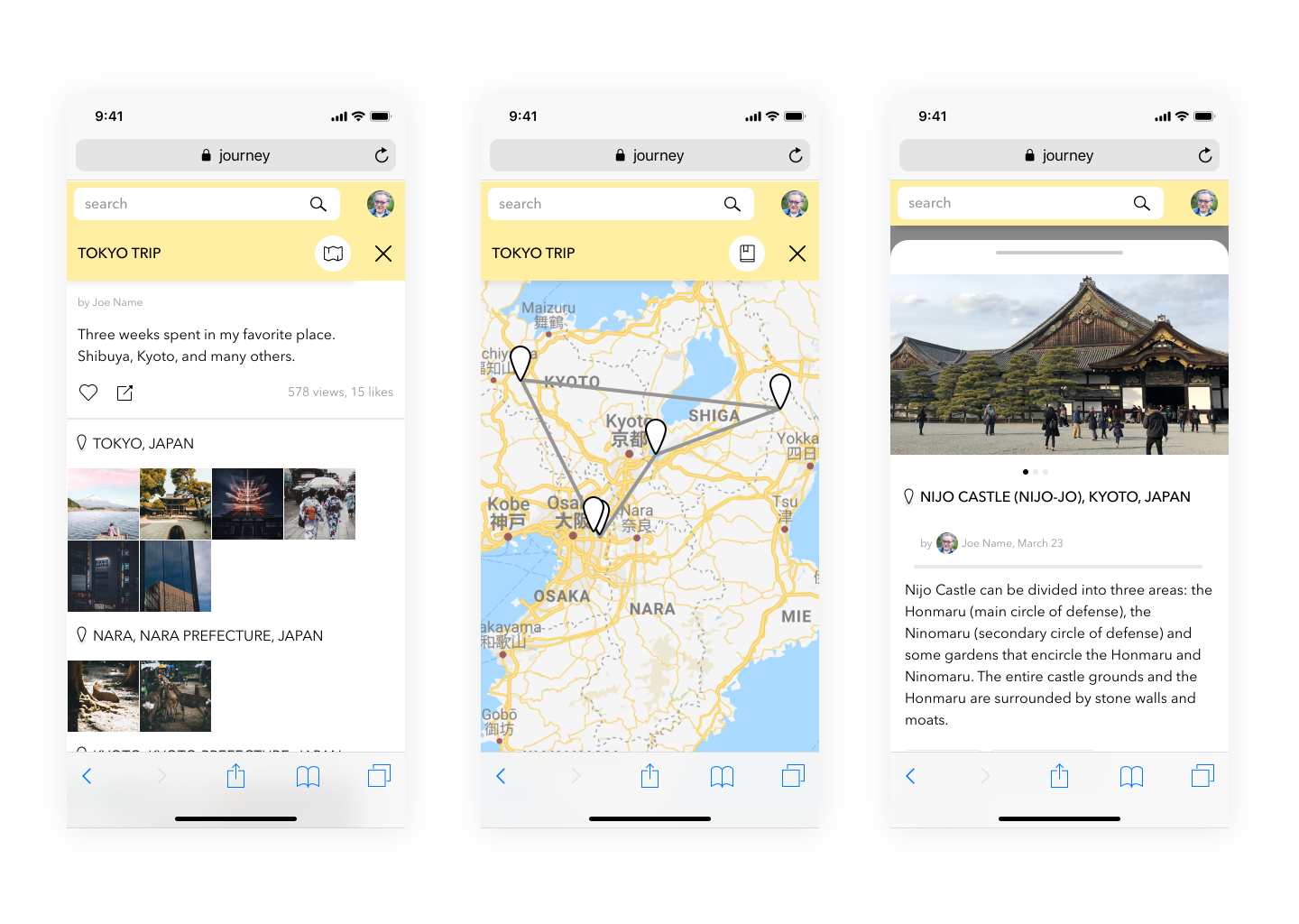
The first thing I focused on designing was the post UI and trip UI. A trip showcases your travel experiences (categorized as posts) and the route you took. Other users can explore trips to help them plan their next adventure, bringing someone else's personal experience and context to the table.
I designed several different iterations of the Trip concept to find the correct balance of user-created information (photos, descriptions, contextual tags) and location context. From these iterations, the map became a central focus and not a secondary accompaniment.
Using the map as the center stage of Journey created a very immersive browsing experience. Users could browse individual posts and quickly pivot to view their related trip or the author of the post's profile, and the map would react in kind.
I fortified this concept by designing interactions to navigate these contexts alongside zooming and panning the map's position. (ex. When selecting a trip from a post, the map zooms out to show the entire trip).
I created mobile and desktop prototypes to test the design with three of my friends. These users figured out the association between a post and its related trip, but their understanding was not immediate on the desktop.
However, shortly after they figured it out, the users really enjoyed the interaction flow of using the Trip itinerary to navigate through different posts.
I attributed this friction to the space between the post and the trip itinerary. As a result, it was hard to immediately understand the relationship between the post and trip UIs in the desktop designs.
I adjusted the desktop designs to follow the same parent/child association(only showing a post or a trip one at a time) as the mobile design. I tested the revised prototype with three new users, but it actually took significantly longer to navigate through multiple posts than the first group, and they had a harder time describing the relationship between a post and a trip when asked about it.
Removing the ability to see the trip itinerary and posts simultaneously hindered the browsing experience, making navigation clunky and slow.
I decided to use the original design and enforce the relationship through more compelling interaction animation.
Results
Since this was a passion project of mine and not an actual product launch, I can’t speak to real-world success metrics.
However, after release, I would track the following metrics to evaluate success.
# of new account signups every month
# of new posts and trips created every month
# of social interaction on posts and trips every month
% of users who are repeat visitors
Conducing a survey of users who utilized Journey in their trip planning experience to determine if they felt it was helpful or not (evaluating answers on a scale of 1-5 from strongly disagree to strongly agree)


